Fruit farm branding

FrankenFruit is my family’s pick-your-own fruit farm. I’m responsible for everything that has to do with digital and design, from the initial idea to production.
Since I was a kid, I’ve been working on my family’s fruit farm. Nowadays, I manage the design, build out our website, run Meta ad campaigns, create everything from product labels to the farm map. It’s a little bit like a playground where I can try out new things and see what works, which provides me with valuable direct feedback from our customers.
Challenges
- Creating a consistent yet evolving design over many years
- Cultivating a hip image, avoiding a dusty rustic farm shop look
- Working with extreme budget restraints
- Creating simple, reusable systems for maximum efficiency
Many people think it's easy to pick your own fruit and vegetables. But it usually turns out that they're sorely mistaken. It's what makes designing for a large physical space — 12 hectares — so challenging. Add to that the fact that crops rotate every year, and seasonality of the different products, and you have a recipe for disappointed customers. Oh, and, many customers have an immigration background, which means they speak little or no Dutch. In short: a lot of challenging factors.
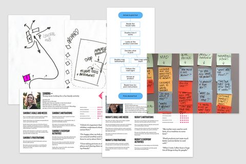
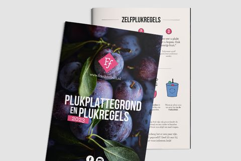
A lot of time is invested in making sure visitors – or if you prefer, users – know what's available even before they visit. New customers not only get a 'first time visitor' page, but can also watch an instructional video on how it works. Way-finding systems such as signs and a map point people in the right direction. On the fields and in the orchards, little signs point the way. Some signs are available in 6 languages.
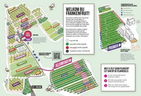
Which is all great of course, but in my experience there will always be people who don't look at a map, walk right by all the signs, and don't have the patience to watch a 60 second video. For them, you need people on the ground to explain it to them. Our solution? Have the experienced customers help the newbies!
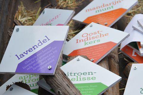
And that's just solving the user experience.
The branding
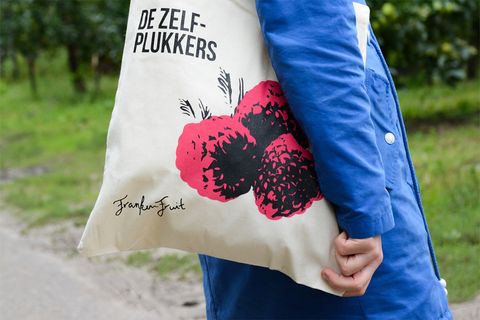
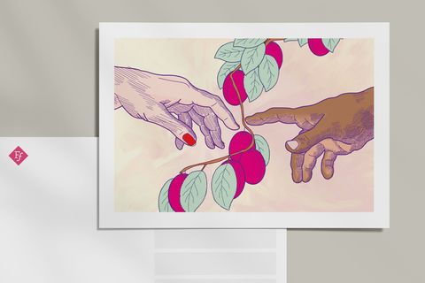
Many farm shops are dusty affairs: wooden crates, faux lithograph prints, earthy tones... For FrankenFruit, we went in the other direction. Instead, the design is colorful, bold and playful. This provides the consistent factor and adds a layer of timelessness. This helps solve a central problem: budgets are limited and there's no space for a big bold redesign where everything is produced all at once. Things are added when needed, or when new insights are discovered. The bold, playful and colorful design helps keep it all together.