FrankenFruit
Fruit farm identity
from maps to ux to juice labels
Intro
FrankenFruit is my family’s pick-your-own fruit farm. I’m responsible for everything that has to do with digital and design, from the initial idea to production.
Since I was a kid, I’ve been working on my family’s fruit farm. Nowadays, I manage the design, build out our website, run Meta ad campaigns, create everything from product labels to the farm map. It’s a little bit like a playground where I can try out new things and see what works, which provides me with valuable direct feedback from our customers.
creative direction
Branding
Social
Web
Print
Illustration
User Experience
The Work
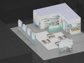
location map

map details


ux research results

One of pain points that came out of the research was that visitors often couldn’t find the products they wanted, or they were unsure what they cost. People generally don’t want to be a burden so we needed a bold way to present them with the information they need across multiple touch-points.
information touch-points


Products and merch


Challenges & Learnings
- Creating a consistent yet evolving design over many years.
- Cultivating a hip image, avoiding a dusty rustic farm shop look.
- Working with extreme budget restraints.
- Creating simple, reusable systems for maximum efficiency.