Setrise
Product Design
THE CHALLENGE
Research, design and plan an app that shows people a prediction on the quality of the sunset, allowing them to plan their activities around it, and bring nature’s beauty into their lives.
THE PROCESS
Competitor research
User research
Defining problem statement
Fast Prototyping
Wireframing
Prototyping
Defining the MVP
Monetisation strategy (not shown)
Development < current
THE RESULT SO FAR
Setrise; an iOS app that displays previews and predictions on what the day’s sunset might look like. Current total time investment is around 60 hours.
EXTRA CONTEXT
This is a project of passion that I work on in my spare time. It was inspired by a walk I took with a friend, where we saw the sky light up in the most beautiful colours, but were not in the right place to get a clear view of the sky.
KEY THINGS I DIDN’T KNOW BEFORE I STARTED
– Is it technically feasible?
– Is there a need for this?
WHAT IS HAPPENING IN THE SPACE
The first thing I did after my initial flash of inspiration was to see whether something like this does not already exist. And if it does, to see how it can be improved, or what I could do to differentiate myself. As it turns out, there are indeed apps and businesses that predict sunset quality. They’re just not very good:

Image: SkyFire, part of the Photographer’s Ephemeris. “Look, the sunset is going to be great on the other side of the country! Let’s go!”

Image: SkyCandy, a sunset prediction app for Android (though for some reason they’ve mocked it up into an iPhone). I like how they explain what the quality means in text form.
SkyCandy has as a strength that it provides relatively accurate information, at least according to the reviews. However, the UI is severely lacking.
The Photographers Ephemerides seems useful until you think about it a little more. If I’m looking for information about the quality of the sunset, what benefit is a map to me? Sunset quality isn’t measured on a scale of a few kilometres, and traveling somewhere with better conditions would require a lot of time, by which time the predictions might change. On top of that, the UI isn’t exactly easy to understand.
However, most importantly, what this stage told me was that it is at least possible to predict a sunset with some accuracy.
DO PEOPLE ACTUALLY WANT THIS? AM I FULFILLING A NEED?
Next, I needed to know what other people thought about my idea. Especially as this started as a passion project. Was my enthusiasm blinding me to serious weak spots in my idea?
My instinct told me this wasn’t the case. I’d seen so many people sitting on beaches or parks staring at sunsets, and what always struck me was how serene they looked. Like they found a kind of peace. I thought it would be extremely interesting to look into these emotional aspects. To find out more, I designed a research plan.
RESEARCH GOALS
I defined several research goals.
#1 People’s attitudes to sunsets
What sort of emotional state do they experience? Is it memorable for them? What value does it add to their day or their lives?
#2 The effect of sunsets on behaviour
Are sunsets something that they go out of their way to experience? Do they somehow try to predict it themselves? Do they plan certain activities around it?
#3 Potential for behavioural change
If they could have good predictions, would it be important enough to change their behaviour?
#4 Attitudes towards predictions
How do people cope with inaccurate predictions? Would they delete the app, or would they accept that it is in essence a weather phenomenon, and therefore hard to predict?
#5 Required features and presenting information
How do they want the information to be presented? Are there features I didn’t foresee? How would I go about describing a certain sunset in a way users understand?
With the research goals defined, I started writing questions for an interview to gain more insights into users’ thinking. I discovered several very interesting things, and my next step was to quantify these findings through a survey. This helped me answer questions such as:
– How many people think this way?
– Are there differences in age groups?
– Is there a gender breakdown?
At the moment, I’m keeping the findings from my research under wraps, and with that also the problem statement and solution. Sorry about that! Happy to talk about them one-on-one. However, my findings were encouraging enough to proceed creating a prototype.
CREATING THE PRODUCT
With the research in hand, the easy part was over. There were two phases to this: What was it going to take to make this product a success? How would it work? My favourite way to do that is with pen and paper. There’s just something about it that’s more flexible.


Images: the first scribbles I made on functionality and a rough wireframe. Excuse the handwriting; it was done while on a park bench.
I went straight from these sketches into high-fidelity wireframing. Normally, I would first do mid-fidelity wireframes. But because this app is relatively non-complex, I felt like that wasn’t necessary. Especially because the design of the app itself was going to play a bit part in making it a success.
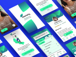
THE FIRST DRAFT

Some UI exploration.
REVISED VERSION
Inspired by old travel posters, I wanted users to have some eye-candy whenever they open the app, even if the forecast for that day and the next would not be interesting. Though still a flat design, I wanted it to feel more like the paper of a poster, and move away from the ubiquitous round edges in mobile design everywhere.

Always a great source of inspiration; old posters.

A view of the updated version of the app.
Each graphic is unique, because it’s randomly generated from a large set of SVG clouds which can vary in colour, with also variations in the main background colour. Information on cloud cover at certain altitudes determines which types of clouds appear where on the screen and how many.
Reactions to the design have been overwhelmingly positive. Though usability testing did reveal some problems:
– Users didn’t realise these are clouds at 3 different altitudes.
– Users need information on temperature and chance of rain more prominently as it’s an important factor in their decision-making.
– Users wanted to be able to see the sunset at another location.
While working on the design, I started doing technical research. From the competitive analysis, I knew that something like this must be possible. But how do they do it?
In parallel, I started talking to developers to get an idea of how long it would take to make, and how complicated it would be. I went back to the problem statement I defined from my research, and looked at which features I needed to include to provide a solution.

To test out whether the solution works in a real environment, the MVP needs only the features in black.
MORE TO FOLLOW…
From here on, Setrise is still a work in progress and what you see above is subject to change. If all goes well, a working prototype will be available in two months. In the meantime, check out the design prototype through the link above or below.
LINKS
SEE ALSO
www.dribbbl.com/PaulFranken