
Starterly
UX Research & UI Design
THE CHALLENGE
Research, design and create a responsive web app that enables anyone, anywhere to instantly chat with an expert in virtually any field.
THE PROCESS
My process was to start with extensive competitive analysis and user research. The findings from this informed the niche the project would occupy. From this research, I synthesised user personas and user stories. I planned how the product would work through detailed user flows. From these, I designed the wireframes, starting with pen and paper fast prototyping down to high-fidelity wireframes. Ultimately, I submitted it to two rounds of usability testing to finesse the final mockup.
THE RESULT
Starterly: a responsive web app that allows users to connect with people who have experience with or knowledge about how to start a business.
KEY THINGS I DIDN’T KNOW BEFORE I STARTED
– Who, in the eyes of users, are experts?
– What sort of problems do people need experts for?
– How much are users willing to pay for advice?
UNDERSTANDING THE SPACE: PROBLEM STATEMENTS AND COMPETITIVE ANALYSIS
The first step was to do an initial fact-finding mission and understand the problem space. I hypothesised several possible problems, formulated a problem statement, as well as the possible solutions.

Next, I wanted to see what other competitors were on the market. The scope at this stage was still very broad and the question I wanted to answer way: “Does a platform where anyone can connect with anyone actually work?”


")
Gallery: Results from the competitive and UX analysis.
I noticed that there were no competitors that managed to pull off a platform that works for everyone. My instinct told me that such a platform needs a clear niche: something that can solve everyone’s problem simply sounds too unrealistic. The platforms I analysed were plagued with quality problems due to their lack of focus.
EXPLORING THE PROBLEM SPACE THROUGH USER RESEARCH
Next, I started conducting user interviews. After defining the research goals, I did 6 interviews with people from different backgrounds.


")
")
Gallery: The research goals defined for the project and the insights derived from the user research.
GENERAL RESEARCH FINDINGS
- Most people only turn to experts after asking their friends or searching on the internet.
- Finding experts is difficult.
- The definition of who is an expert is extremely vague and subjective.
- Many people want answers right away.
- People all have unique problems and situations.
- Users can not quantify costs per minute for experts.
SPECIFIC PROBLEM AREAS
- Users who want to start a business but don’t know where to start.
- Asking for impartial opinions or advice.
- Help with problems in a new country.
- Problems with house plants.
CHANGES BASED ON RESEARCH FINDINGS
From the answers I received it became clear to me that a platform that tries to work for everyone would be a platform that works for nobody. The platform needed to specialise in solving the specific problems of a narrow set of users.
It was then that I realised that I could have the best of both worlds. I would design a platform that could be customised, or reskinned, to focus on a specific problem. I called the technology Buoy.

Some quick mockups of problems to which the technology could be applied.
CREATING PERSONAS FOR THE PLATFORMS
I already had created two personas that inspired Starterly and Localisa. Dear reader, meet Jake and Becky. To craft the details of how the platform should work, I decided to focus on building a platform that would meet Jake’s needs.

")
")
Gallery: Jake persona and user journey
STARTERLY: JAKE’S USER FLOW
I explored in detail what Jake would need to complete his user journey. These detailed user flows would become the basis for the design of the wireframes and mockups.

The user flow for Jake and Starterly.
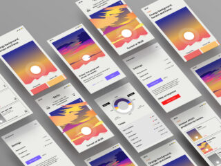
FROM FAST PROTOTYPING, TO MID-FIDELITY, TO HIGH FIDELITY MOCKUPS
The wireframes were created in three stages: rapid prototyping on paper, digitising them into mid-fidelity wireframes, and finally the creation of the high-fidelity mockups.

Above: An illustration of the steps from fast prototyping to high fidelity mockup of a single screen. Below: a gallery showing a few different screens.


USABILITY TESTING HELPED POLISH THE DESIGN
The mid-fidelity wireframes were subjected to thorough testing to weed out any problems. Testing generally went smoothly, but I did identify some areas of improvement. I used a rainbow spreadsheet to help me find the most pressing errors.

A screenshot from the rainbow spreadsheet I used to analyse the usability test results.
THE OTHER SIDE OF THE FENCE
Above I’ve outlined how I’ve created Starterly. This, of course, is only one side of the app. Starterly, and other apps in the Buoy family, are platforms powered by two sets of users: those with problems, and those with solutions. In the future, I plan to investigate and build the other side of the user experience. It will be extremely interesting to see how those two sides interact.
RETROSPECTIVE
Starterly was great fun to make and I learned an absolute ton. One of the most helpful parts of the process was gaining access to a huge new toolset, from user research, to user flows, to card sorting, as well as becoming familiar with great online tools for creating sitemaps and user flows (Flowmapp), preference testing (UsabilityHub), and wireframing (Figma).
In the future, I’ll be extra attentive when I define my research goals. These were a little off at first, which meant that the insights I generated were a little shallow. It took another round of interviews to correct this. Moving forward, I’ll definitely put more weight on that.
CREDITS
Text and design: Paul Franken
SEE ALSO
www.dribbbl.com/PaulFranken
Leave a Reply